Color Palettes
Tonal storytelling
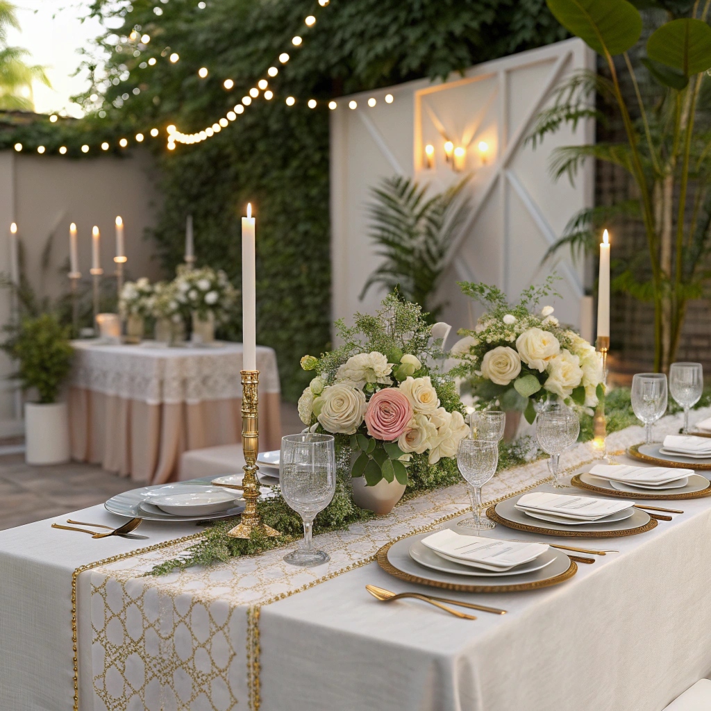
Color is fundamental to atmosphere. We develop palettes that feel both intentional and natural—tones that support the occasion without dominating it. Each palette tells a story through subtle variation and careful coordination.
#1E2328
#E7E3DC
#CFC8BF
#C2A875
#FAF8F5
Evening Light
Our primary palette draws inspiration from evening light—deep, rich tones balanced with warm neutrals. This palette creates a sense of calm elegance, suitable for intimate gatherings that extend into the evening.

Palette Development
We develop color palettes through conversation and observation. Understanding the space, the time of day, the season, and the desired atmosphere guides our color selections.
Each palette is built around a primary tone, with supporting colors chosen to create harmony rather than contrast. We favor subtle variation over dramatic difference.
Material and Color
Color exists in relationship with material. The same tone reads differently on linen than on ceramic, on wood than on metal. We consider how materials interact with light and how that interaction affects color perception.
This understanding allows us to create palettes that feel cohesive across different materials, maintaining visual harmony while celebrating the unique qualities of each element.